


Brand Remastering Project
▪︎ Year: Apr 2019 - Dec 2019
▪︎ Role: Brand Strategy Development, Copywriting, Research and Visual Design Directing
▪︎ Status: Completed
▪︎ Team: TWC
In the MARU branding remastering project, a focus was placed on Brand Strategy and Copywriting to highlight MARU’s unique story and distinctiveness. Known as Korea’s Silicon Valley, MARU is located on Yeoksam-ro and comprises two primary spaces: the startup coworking space MARU180, opened in 2014, and its subsequent expansion, MARU360, launched about seven years later. Operated by Hyundai’s Asan Nanum Foundation, MARU represents these collective spaces. The project successfully preserved the brand’s heritage while rendering the MARU brand more tangible through strategic Verbal/Visual design.
1_Verbal Branding
MARU Brand Platform (2020)
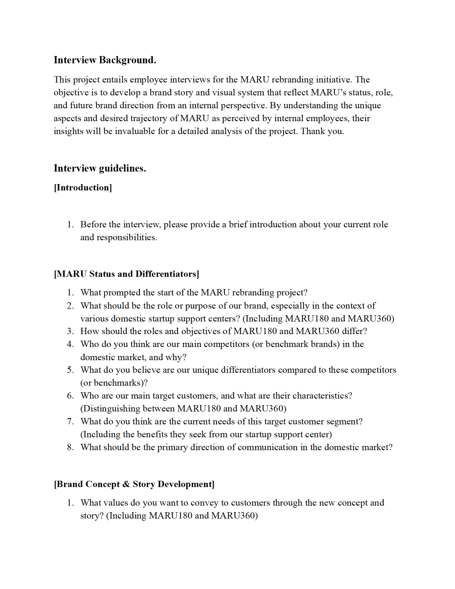
MARU Brand Assessment Survey: Uncovering Current Positioning and Future Direction
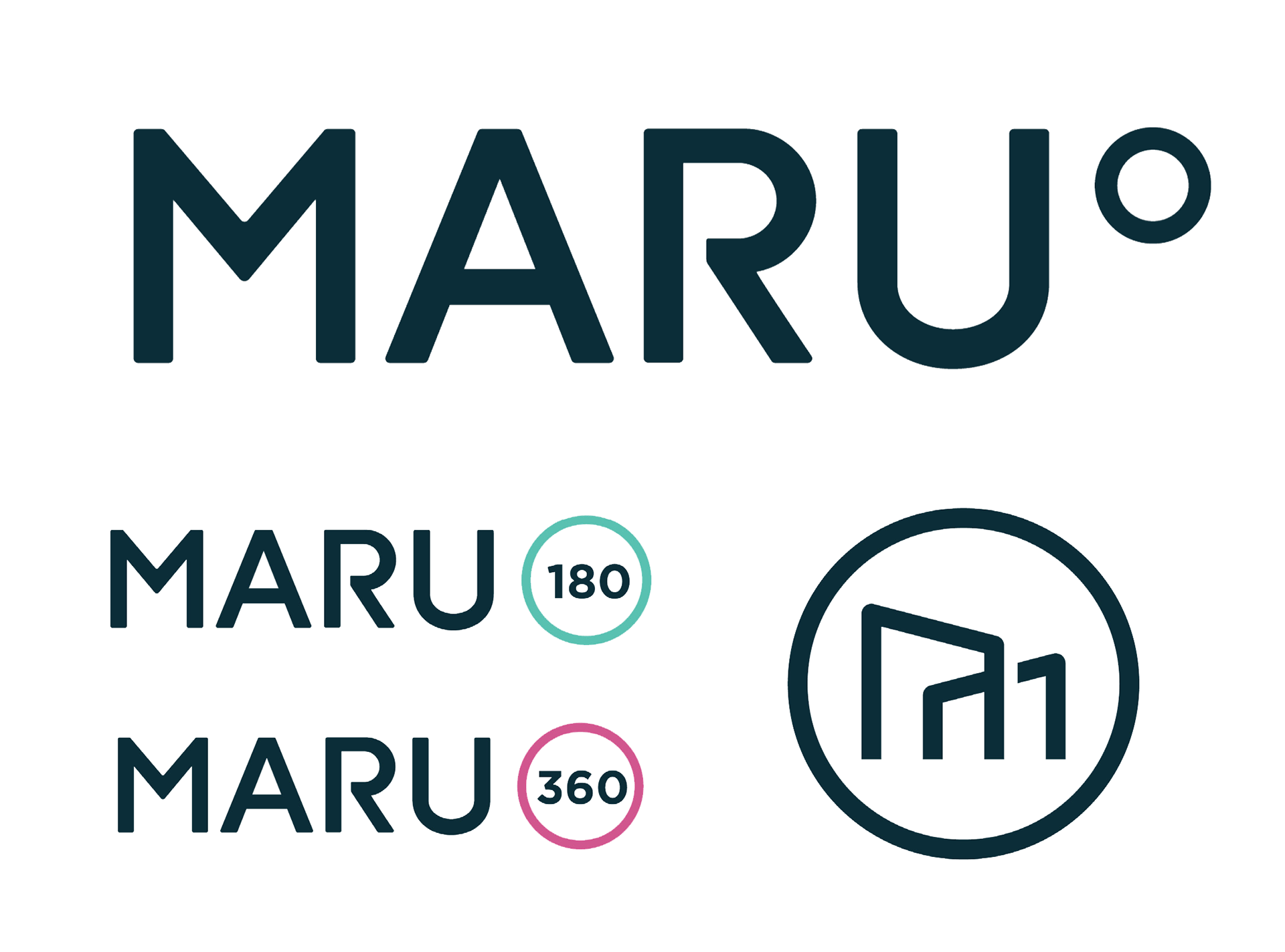
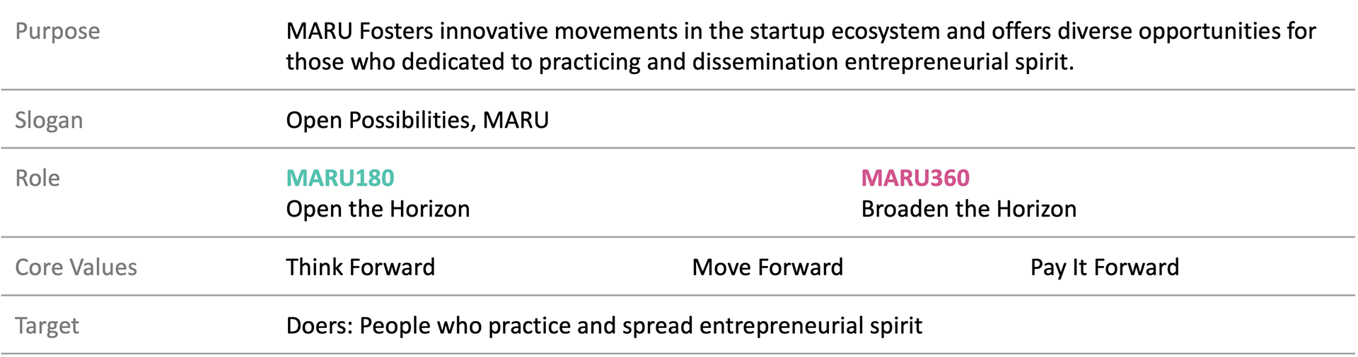
Before designing new elements, understanding MARU’s identity was essential, achieved through interviews with startup members and residents. These insights redefined MARU as a platform for growth, inspiring the slogan ‘Open Possibilities’ and narratives reflecting Hyundai founder Chung Ju-yung’s entrepreneurial spirit. The project also clarified the distinct yet complementary roles of MARU180 and MARU360, shaping a cohesive brand story.
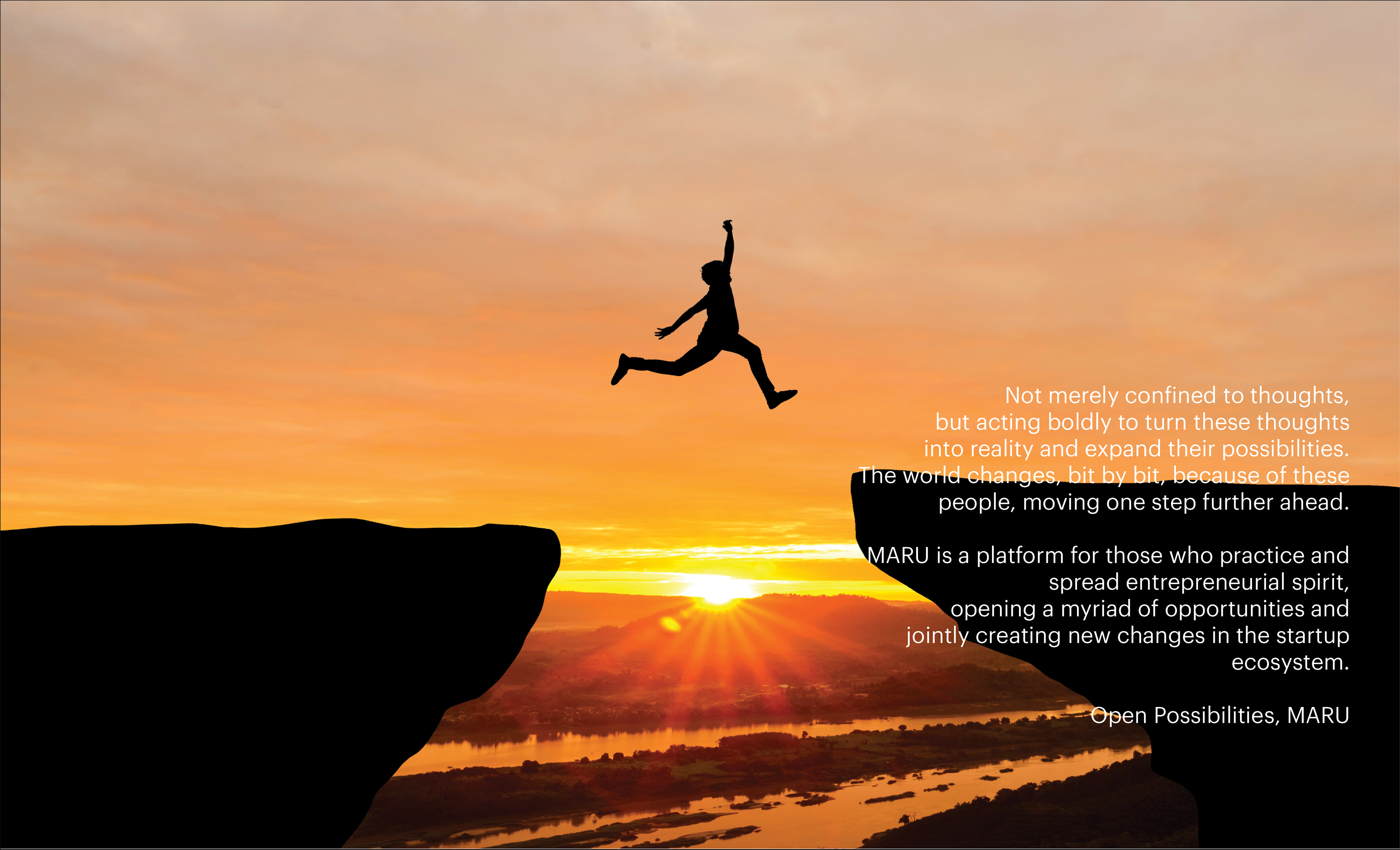
MARU Brandstory
2_Visual Branding
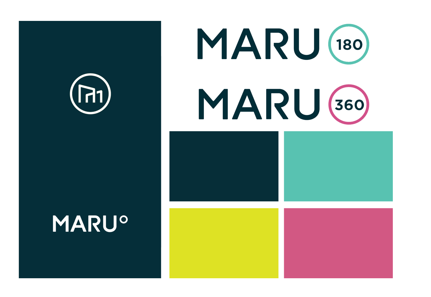
MARU’s rebranding refined the logo for better clarity, distinguishing the wordmark from the symbol while modernizing the iconic M-shape. Subtle angular elements referencing 180 and 360 enhanced its visual appeal, and a refreshed color palette of dark green and lime green better resonated with a younger audience. The sub-logotypes for MARU180 and MARU360 were also revamped, improving versatility while preserving the brand’s core identity.
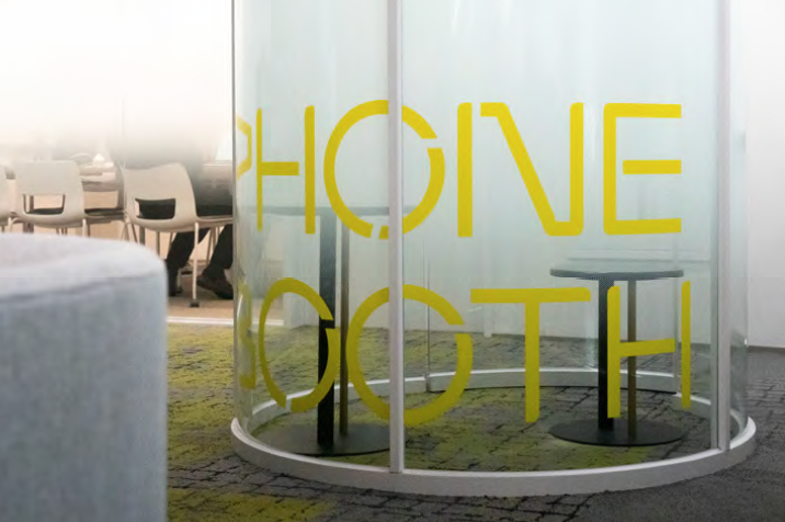
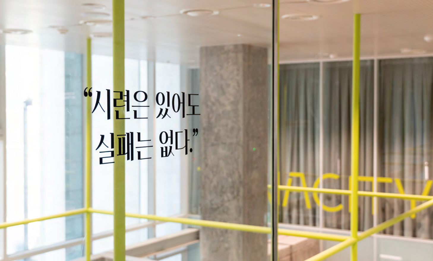
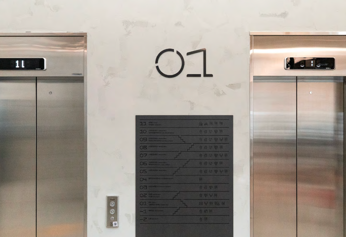
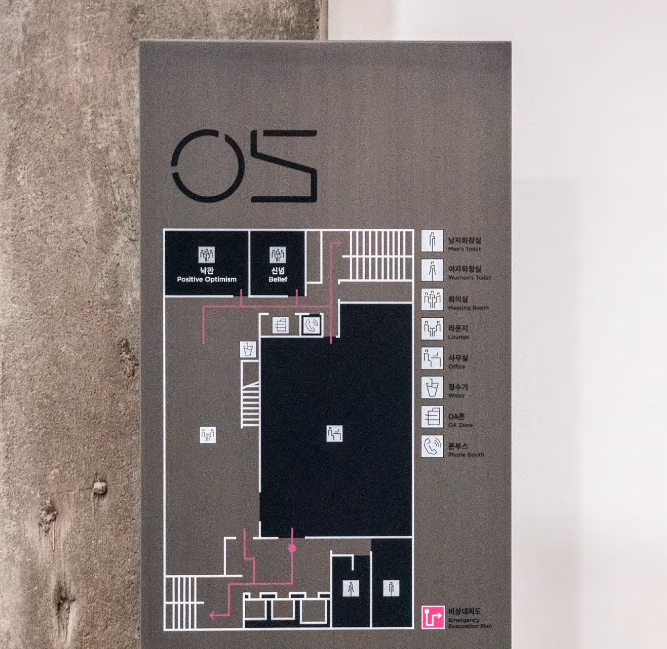
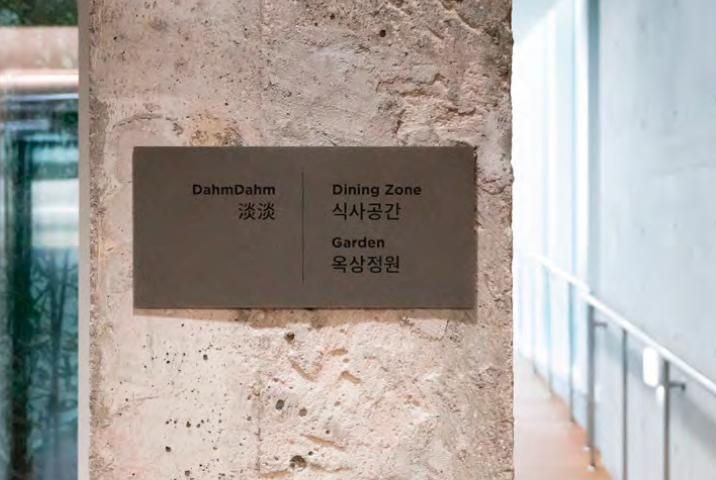
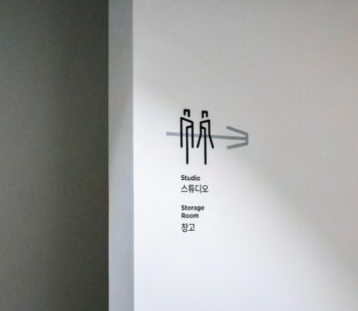
3_Brand Application - Signage, Wayfinding
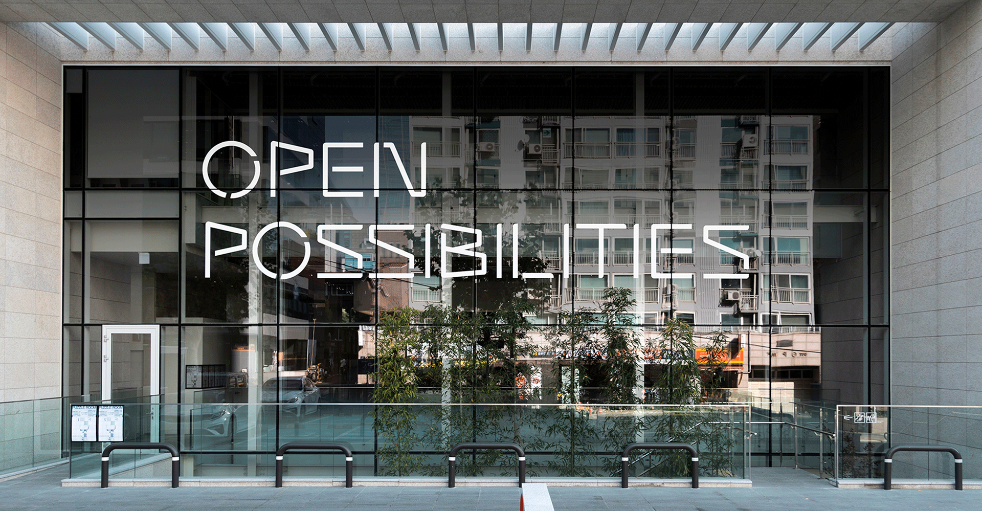
MARU’s rebranding and slogan have been seamlessly integrated into the signage at MARU180 and MARU360 through a collaboration with 1-1 Company. Centered on ‘OPEN POSSIBILITIES,’ the design system incorporates unique fonts, pictograms, and graphic motifs inspired by registered signage, reinforcing MARU’s unified brand identity.
▪︎ Year: Jun 2021 - Dec 2021
▪︎ Location: Gangnam, Seoul
▪︎ Role: Concept Design Directing and Project Management
▪︎ Status: Completed
▪︎ Team: 1-1 company, MSPLAN
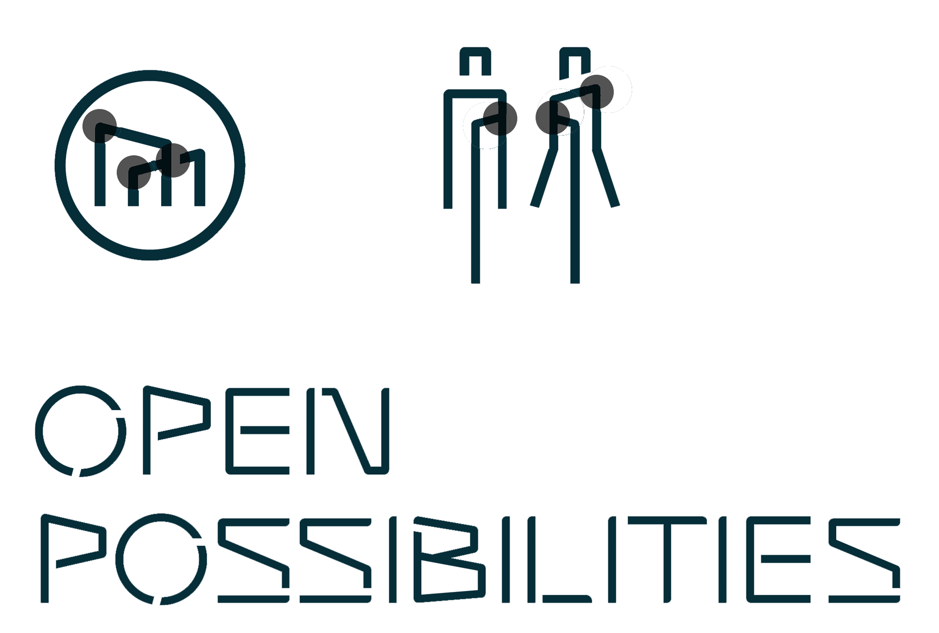
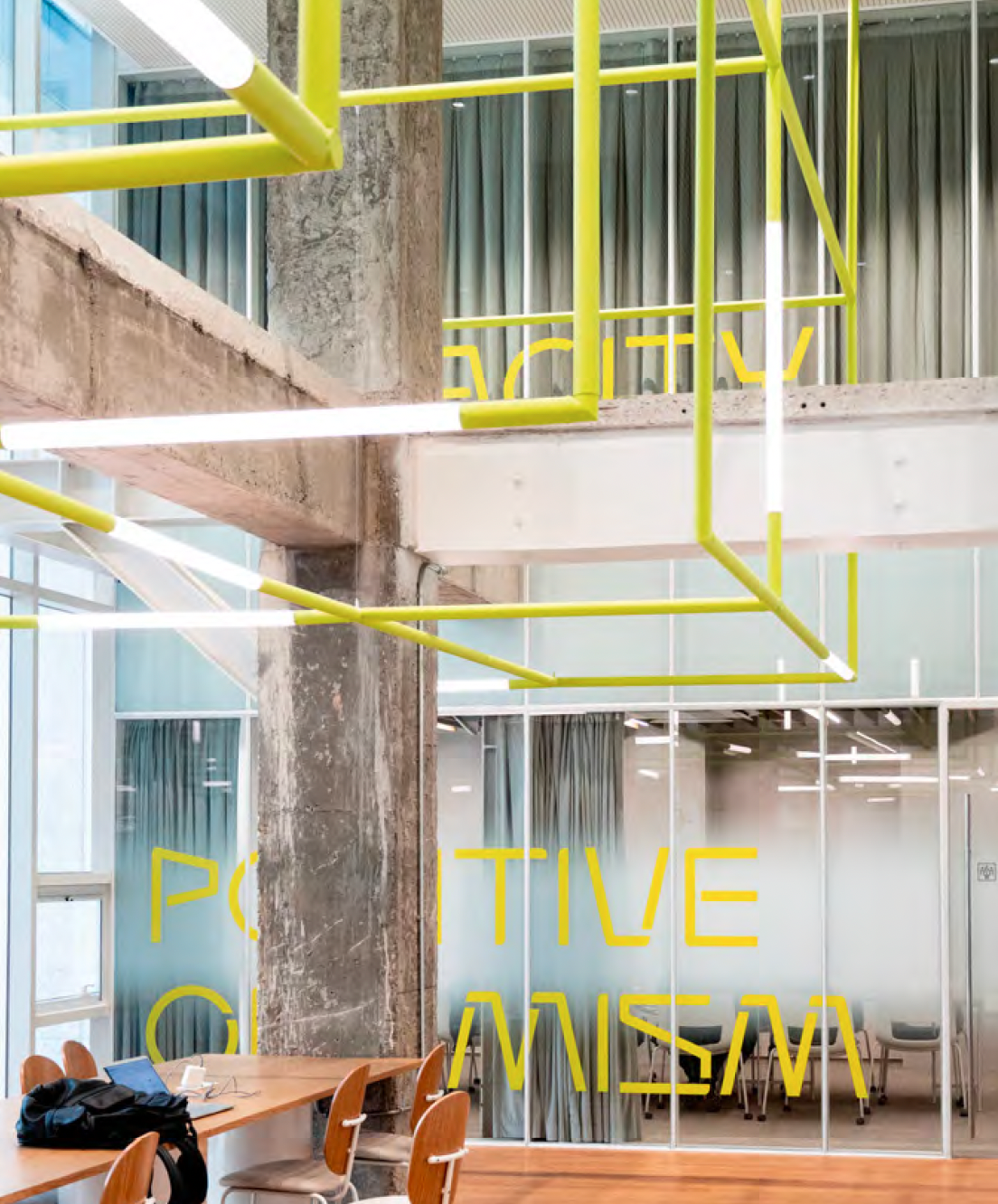
From Symbol to Typography
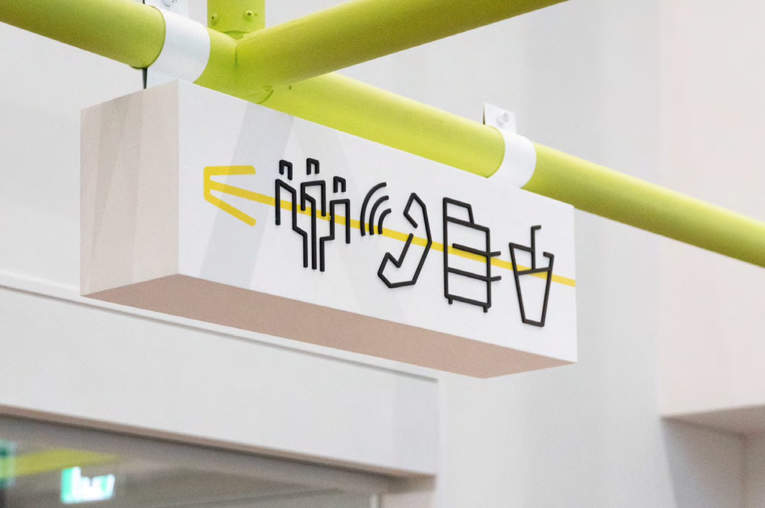
Signage and Wayfinding